Noa Lind - brand identity, packaging and editorial design
Independent designer and art director in Lisbon. For twelve years I have been giving small, careful companies a name on the shelf and a voice on the page.
Booking projects from March 2027
Scroll




All projects
What I do
Four things, done properly. Most projects start with one of them and quietly grow into the others.
I work alone or with a small circle of photographers, writers and printers I trust. That keeps every project close: you talk to the person who draws the letters, chooses the paper and checks the proofs. It also means I take on a limited number of projects each year, so each one gets the attention it deserves.
01
Brand identity
A brand identity is the sum of small decisions made once and repeated everywhere: a name set in the right letters, a mark that survives a stamp and a screen, colours that hold up under shop lighting. I build identities as working systems, with clear rules for type, colour, layout and image, so your team can use them long after the launch. Every identity comes with a short, practical guide instead of a hundred page manual nobody opens.
Logo and wordmark, Typography, Colour system, Brand guidelines
02
Packaging design
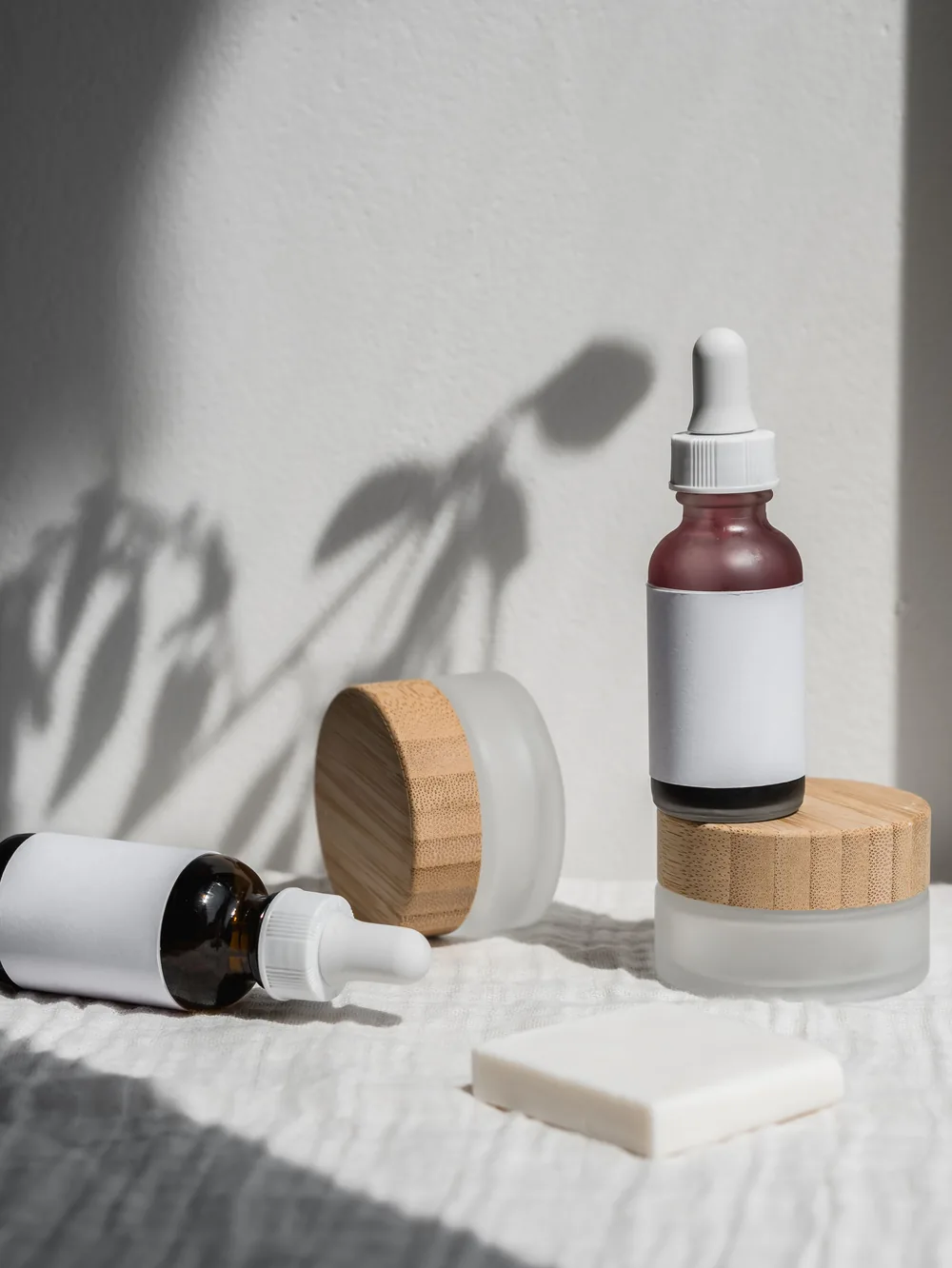
Packaging is the only part of a brand people hold in their hands, so it has to feel right before it is even read. I design boxes, labels, bottles and wraps from the first sketch to the final print check, working closely with your printer on paper, finishes and costs. The goal is a range that looks calm on a crowded shelf and still makes sense when the fifth product joins the family.
Labels and boxes, Product ranges, Print supervision, Dielines
03
Editorial design
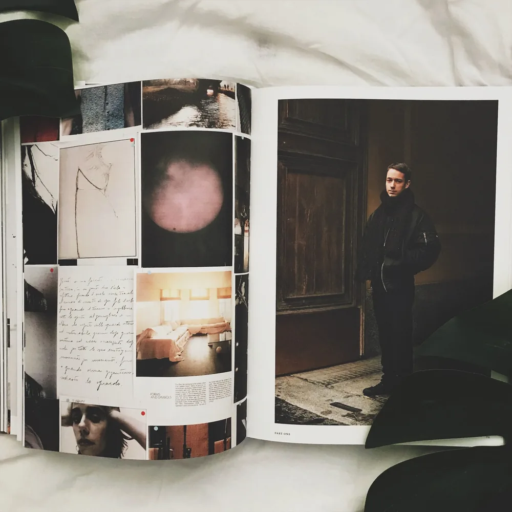
Books, catalogues, magazines and annual reports need a grid that carries a lot of content without feeling heavy. I design editorial systems with a clear hierarchy, generous white space and typography chosen for long reading. From a single exhibition catalogue to a quarterly magazine, every layout is built in templates your editors can keep using on their own.
Books and catalogues, Magazines, Layout templates, Typesetting
04
Art direction
Good design needs good images. I plan and direct product and still life shoots, write the shot lists, pick the light and props, and work on set with the photographer. The result is a library of images that look like they belong to one brand, ready for the website, the shop window and social media.
Photo direction, Shot lists, Set styling, Image libraries
How a project runs
Six to twelve weeks, start to print
i.
Listen
We start with a long conversation about your company, your customers and the shelf you will stand on. I visit the workshop when I can. You get a one page brief we both sign.
Week 1
ii.
Explore
Two or three clear directions, each shown on real objects: a label, a page, a box. No mood boards that promise everything. We pick one together and sharpen it.
Weeks 2 - 4
iii.
Build
The chosen direction grows into a full system: type, colour, layout rules and every item on your list. You see progress every week and can follow it in one shared folder.
Weeks 5 - 9
iv.
Release
Final files, a short guide and a print check with your printer. After launch I stay available for small questions, because good brands keep growing.
Weeks 10 - 12
Kind words
“Noa understood our perfumes before smelling them. The new bottles sold out in the first week, and people keep the boxes.”
Inês Carvalho
Founder, Lumen Parfums
“Calm, precise and honest about what would not work. Our catalogue finally looks as careful as the pieces in it.”
Tomas Weller
Studio lead, Kiln & Co
“We came for a label and left with a brand. Two years later, the guide is still the most used file on our drive.”
Maren Holt
Co-founder, Still Apothecary
Recognition
Selected, since 2019
2026
Pentawards, Silver
Lumen Parfums, Luxury packaging
2025
Type Directors Club, Certificate of Excellence
Ember Ceramics wordmark
2024
European Design Awards, Shortlist
Kiln & Co catalogue
2023
Dieline Awards, Honourable Mention
Still Apothecary range
Questions
The things people usually ask before the first call.
Journal
14 Sep 2026 - 6 min read
Why small brands should own fewer colours
One colour you can afford to print well beats five you cannot. A short case for restraint.

2 Jul 2026 - 8 min read
Choosing paper for a catalogue that lasts
Weight, coating and grain, explained through three catalogues we printed last year.

20 May 2026 - 5 min read
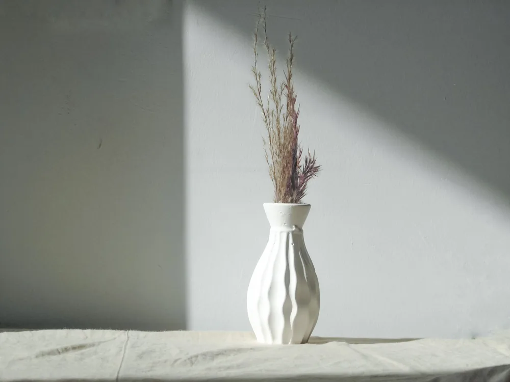
Designing in daylight, checking at night
How the light you work in changes the colours you pick, and a simple habit that fixes it.